By: Joseph X. Rodts
It is a natural process for anything overtime to evolve. In advertising a company or brand often times creates a logo to serve as the face of the brand. A logo will inevitably change as time progresses. In this post I will document some logos that have changed over time and talk about why they did so in order to stay identifiable and recognizable to the consumer.
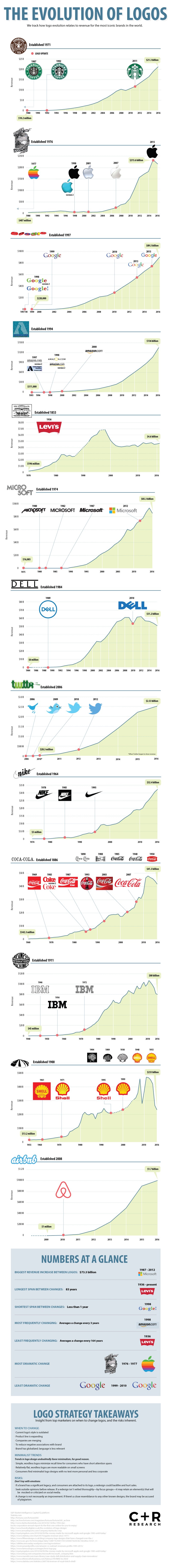
As you can see many of the logos had started from more abstract designs and evolved into simple identifiable logos. It’s great to see this evolution happen over time for a brand because it shows they’re willingness to adapt and change. These logos are seen as currently having a very minimalistic approach to design.
As per the infographic you can see Apple’s drastic changes made to their logo. They went from a tattoo like logo design to a simple out line of an apple. This change is vital to a company because it makes the company logo easily identifiable to the consumer.
On the other hand the Levi’s logo has not changed for the past 164 years. I believe this logo hasn’t changed from it’s initial design due to the fact that this logo is simple and recognizable. Anytime you see the Levi’s jeans they have the Levi’s tab on the back pocket that makes them so identifiable and recognizable.
Other companies like Microsoft and Shell have been on a quest to constantly change their logo to suit the needs of the current time period. Their older logos if they were to use them now would be outdated and place them lower in consumer value. Having a mindset geared towards removing text or changing stylistic touches can create a positive brand image.
Apple’s logo can be compared to Levi’s in that Apple has only had one logo represent them for an extended period of time. Apple has made minor stylistic touches to their logo to adjust their brand image over the years. The same can be seen with Coca Cola their cursive logo has been the backbone of their logo.
To develop, what is most common within a great logo is an identifiable figure. For Twitter it is their bird for Nike it’s the swoosh. A figure can be defined as either a shape or an object. Having a recognizable logo can further the brand amongst competition because consumers become familiar with the product or service and the image that surrounds it.
In reviewing this information I’d ask you to think of some of your favorite brands and visualize their logos. Ask yourself “Why is this logo recognizable to me?” “Is it because of the bright colors or simplistic design?” Think about the product or service associated with that logo.
To conclude when we look at logo’s overtime they change and evolve into what we recognize them as today. Having subtle changes made to the logo is key to adapting to the landscape of the market. A recognizable logo will make a company stand out and succeed amongst it’s competition.
